Case Study: logo
Client
Taco Beats Event DJ
Project Overview
The client requires a modern logo that effectively represents their company.
Challenges
One of the key challenges of the project is designing a visual identity that stands out from competitors while maintaining a strong and memorable brand presence.
Process
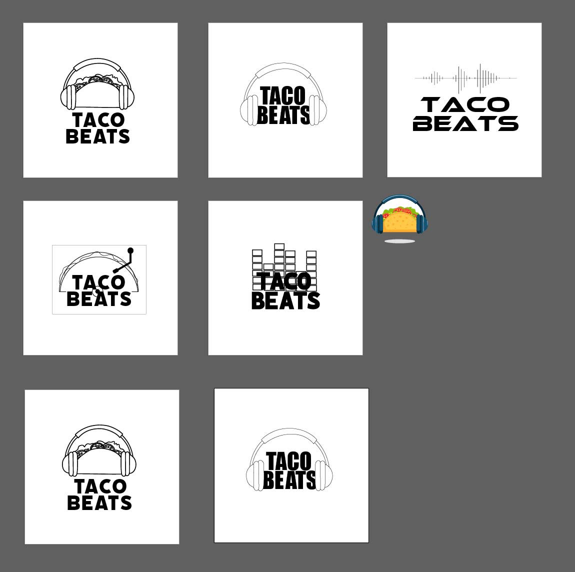
I began by getting to know the client, learning about their preferences, color choices, and font styles while also exploring their background. Next, I conducted online research to compare other DJs in the local area. With this insight, I moved on to developing initial sketch concepts for the project. .

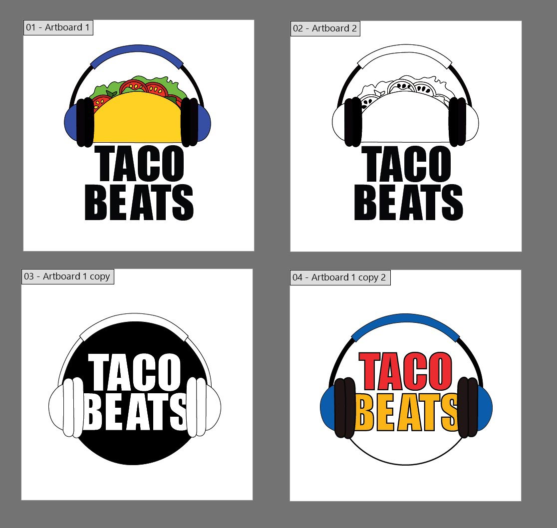
Another revision was completed, allowing the client to choose the logo they preferred the most.

The client selected their preferred version, and I began refining it to perfection.

Design Solutions
The design choices were carefully tailored to align with the client’s preferences and branding needs.
Typography:
I selected fonts that reflected the client’s style and industry. For a DJ, this meant choosing bold, modern, and dynamic typefaces that conveyed energy and professionalism. The fonts balanced readability with a unique aesthetic that made the brand stand out.
Color Scheme:
The chosen colors were based on the client’s initial preferences and psychological impact. Vibrant and high-contrast colors helped create a visually striking design, while complementary tones maintained balance and harmony. The color palette also ensured versatility across digital and print media.
Branding Elements:
I incorporated elements that resonated with the DJ’s identity, such as music-related graphics, custom logos, and sleek design accents. These elements reinforced brand recognition and made the design feel cohesive across various platforms, from social media to promotional materials.
Overall Visual Strategy:
The final design maintained a modern, engaging, and high-energy feel, ensuring it appealed to the client’s target audience. The layout and composition were structured for clarity and impact, ensuring that the brand effectively communicated its message.
By integrating these elements thoughtfully, the design successfully captured the client’s vision while maintaining a professional and marketable presence.
Final Outcome
The final deliverables included a custom logo, typography, color scheme, and digital assets for social media and promotional use.
Impact
The project strengthened the client’s brand identity, increasing visibility and engagement. Early feedback showed positive audience response, leading to more inquiries and bookings.
Images
![[Project Name] Image 2](images/colors.jpg)
![[Project Name] Image 1](images/Taco-Beats-Final-logo-02.jpg)
![[Project Name] Image 2](images/bus-card-t.jpg)
![[Project Name] Image 2](images/hoodie-mockup-featuring-an-ai-generated-cheerful-man-having-fun-at-a-concert-m35690.jpg)
![[Project Name] Image 2](images/round-neck-t-shirt-mockup-of-a-dj-playing-in-a-club-with-flashing-lights-m36428.jpg)
Client Feedback
"She assisted me with everything I asked of her and guided me through anything I had a question about. She was also able to help me with two rush projects for a logo and business cards which were both completed and delivered on time. I was very impressed with her availability, creativity, and professionalism throughout the time working with her. I would highly recommend her to any business or friend and believe she is ready for the workforce."
Conclusion
Reflections & Takeaways
This project emphasized the value of client collaboration and industry research in creating a strong brand identity. Refining details ensured a polished, professional look. Future improvements could include expanding visual assets like motion graphics or merchandise to enhance brand recognition.